9장 컴포넌트 스타일
스타일링 방식
- 일반 css : 기본적인 방식
- Sass : 확장된 css 문법을 사용
- CSS Module : CSS 클래스가 다른 CSS클래스의 이름과 절대 충돌하지 않도록 파일마다 고유한 이름 자동으로 생성해주는 옵션
- styled-components : 스타일을 JS파일에 내장. 스타일을 작성함과 동시에 해당 스타일이 적용된 컴포넌트
Sass
두가지 확장자 .scss .sass 지원한다.
$font-stack : Helvetica, sans-serif
$primary-color : #333

body
	font:100% $font-stack
	color: $primary-color
$font-stack : Helvetica, sans-serif;
$primary-color : #333;

body{
	font:100% $font-stack;
	color: $primary-color;
}
.scss 는 기존 css 방식과 비슷하다. 중괄호와 세미클론 사용
yarn add sass
$red: #fa5252;
$orange: #fd7e14;
$yellow: #fcc419;
$green: #40c057;
$blue: #339af0;
$indigo: #5c7cfa;
$violet: #7950f2;
// 믹스인 만들기 함수처럼 사용가능
@mixin square($size) {
  $calculated: 32px * $size;
  width: $calculated;
  height: $calculated;
}

.SassComponent {
  display: flex;
  .box {
    // .SassComponent .box 효과
    background: red;
    cursor: pointer;
    transition: all 0.3s ease-in;
    &.red {
      // .red 클래스가 .box와 같이 쓰였을 때
      background: $red;
      @include square(1);
    }
    &.orange {
      background: $orange;
      @include square(2);
    }
    &.yellow {
      background: $yellow;
      @include square(3);
    }
    &.green {
      background: $green;
      @include square(4);
    }
    &.blue {
      background: $blue;
      @include square(5);
    }
    &.indigo {
      background: $indigo;
      @include square(6);
    }
    &.violet {
      background: $violet;
      @include square(7);
    }
    &:hover {
      background: black;
    }
  }
}
- 클래스 안에 클래스 작성할 수 있다.
- & 로 같이 쓰였을 때를 지정할 수 있다.
- 믹스인 이라는 함수처러 사용할 수 있는 코드가 있다
변수와 믹스인만 다른 파일로 구분해서 작성한 뒤 import 해도 된다.
@import './styles/utils';
sass-loader 커스터 마이징 가능하다고 하는데, 아직 크게 필요있어보이진 않아서 나중에 보든가 하자
node_modules 에서 라이브러리 불러오기
module 불러올 때 전체 경로 안쓰고 ~ 로 처리해도 알아서 찾아줌
@import '~include-media/dist/include-media';
CSS Module
클래스 이름을 [파일 이름]_[클래스 이름]_[해시값] 형태로 자동으로 만들어서 중복안되게 해주는 기술.
.module.css 확장자 파일
.wrapper {
  background: black;
  padding: 1rem;
  color: white;
  font-size: 2rem;
}

:global .something {
  font-weight: 800;
  color: aqua;
}
클래스 이름 흔히 사용하는 걸로 지어도 됨
왜 why?
우리가 만든 스타일을 직접 불러온 컴포넌트 내부에서만 작동
특정 클래스가 웹페이지 전역에 사용되는 경우라면 :global 붙여서 글로벌 css 명시/
import styles from "./CSSModule.module.css";
const CSSModule = () => {
  return (
    <div className={styles.wrapper}>
      안녕하세요, 저는 <span className="something">CSS Module!</span>
    </div>
  );
};

export default CSSModule;
CSS Module 스타일 파일 불러오면 객체 전달받음.
객체 안에 클래스 이름과 해당이름 고유화한 값이 키-값 형태로 들어있음.
// 다음과 같은 형태
styles = { wrapper : "CSSModule_wrapper_1sbdq" }
여러클래스 사용할 때는 템플릿 리터럴 이용
<div className={`${styles.wrapper} ${styles.inverted}`}>
classnames
css 클래스 조건부로 설정하기 유용한 라이브러리
근데 왜 안돼지 ㅜㅡ
import classNames from "classnames";

const cx = classNames.bind(styles);
const CSSModule = () => {
  return (
    <div className={cx("wrapper", "inverted")}>
      안녕하세요, 저는 <span className="something">CSS Module!</span>
    </div>
  );
};
styled-components
자바스크립트 파일안에서 스타일을 선언하는 방식을 CSS-in-JS 방식이라고 하는데, 그 중 많이 사용하는 라이브러리.
import React from "react";
import styled, { css } from "styled-components";

const Box = styled.div`
  background: ${(props) => props.color || "blue"};
  padding: 1rem;
  display: flex;
`;

const Button = styled.button`
  background: white;
  color: black;
  border-radius: 4px;
  padding: 0.5rem;
  display: flex;
  align-items: center;
  justify-content: center;
  box-sizing: border-box;
  font-size: 1rem;
  font-weight: 600;
  &:hover {
    background: rgba(255, 255, 255, 0.9);
  }

  ${(props) =>
    props.inverted &&
    css`
      background: none;
      border: 2px solid white;
      color: white;
      &:hover {
        background: white;
        color: black;
      }
    `};
  & + button {
    margin-left: 1rem;
  }
`;

const StyledComponents = () => {
  return (
    <Box color="black">
      <Button>안녕하세요</Button>
      <Button inverted={true}>테두리만</Button>
    </Box>
  );
};

export default StyledComponents;
taged 템플릿
일반 템플릿하고 다르게 템플릿 안의 JS 객체나 함수가 전달할 때 온전히 추출한다.
일반 템플릿에 객체, 함수를 넣으면 형태를 잃어버리게 된다. → 그대로 문자열화 된다.
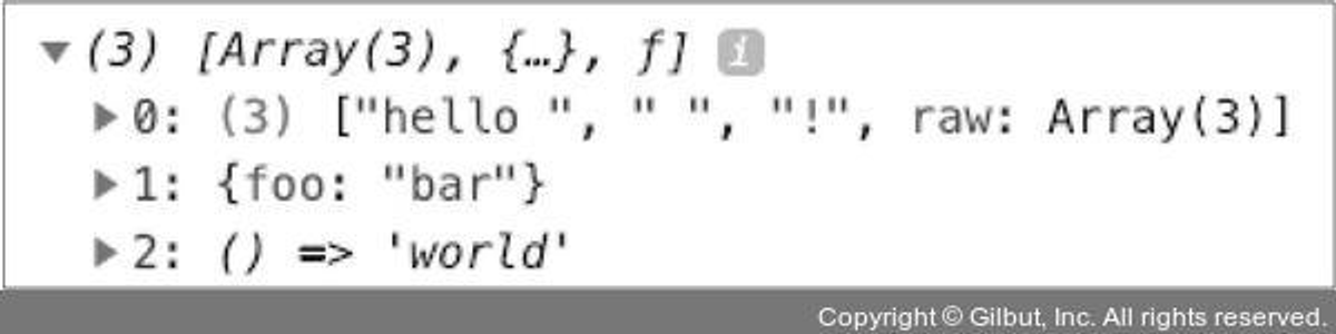
`hello ${{foo: 'bar' }} ${() => 'world'}!`
// 결과: "hello [object Object] () => 'world'!"
function tagged(...args) {
console.log(args);
}
tagged`hello ${{foo: 'bar' }} ${() => 'world'}!`
스타일링된 엘리먼트 만들기
styled.태그명 사용해서 구현
import styled from 'styled-components';

const MyComponent = styled.div`
  font-size: 2rem;
`;
유동적인 태그명이나 컴포넌트 자체에 스타일링 해줄 수도 있음.
// 태그의 타입을 styled 함수의 인자로 전달
const MyInput = styled('input')`
  background: gray;
`
// 아예 컴포넌트 형식의 값을 넣어 줌
const StyledLink = styled(Link)`
  color: blue;
`
스타일 props
styled-component 사용하면 컴포넌트에게 전달된 props 값 참조 가능
const Box = styled.div`
  /* props로 넣어 준 값을 직접 전달해 줄 수 있습니다. */
  background: ${props => props.color || 'blue'};
  padding: 1rem;
  display: flex;
`;

<Box color="black">(...)</Box>
props 값에 따라서 조건부 스타일링 가능하다.
/* 단순 변수의 형태가 아니라 여러 줄의 스타일 구문을 조건부로 설정해야 하는 경우에는
css를 불러와야 합니다.
*/
const Button = styled.button`
  background: white;
  color: black;
  border-radius: 4px;
  padding: 0.5rem;
  display: flex;
  align-items: center;
  justify-content: center;
  box-sizing: border-box;
  font-size: 1rem;
  font-weight: 600;

  /* & 문자를 사용하여 Sass처럼 자기 자신 선택 가능 */
  &:hover {
    background: rgba(255, 255, 255, 0.9);
  }

  /* 다음 코드는 inverted 값이 true일 때 특정 스타일을 부여해 줍니다. */
  ${props =>
    props.inverted &&
    css`
      background: none;
      border: 2px solid white;
      color: white;
      &:hover {
        background: white;
        color: black;
      }
    `};
  & + button {
    margin-left: 1rem;
  }
`;

<Button>안녕하세요</Button>
<Button inverted={true}>테두리만</Button>
조건부 설정할 떄 앞에 css 붙여서 tagged 템플릿 리터럴 사용해줘라
반응형 디자인
meadi 쿼리사용하는데, 컴포넌트마다 반복하면 귀찮음
→ 작업을 함수화해서 사용
const sizes = {
  desktop: 1024,
  tablet: 768
};

// 위에 있는 size 객체에 따라 자동으로 media 쿼리 함수를 만들어 줍니다.
// 참고: https://www.styled-components.com/docs/advanced#media-templates
const media = Object.keys(sizes).reduce((acc, label) => {
acc[label] = (...args) => css`
  @media (max-width: ${sizes[label] / 16}em) {
    ${css(...args)};
    }
`;

return acc;
}, {});

const Box = styled.div`
/* props로 넣어 준 값을 직접 전달해 줄 수 있습니다. */
background: ${props => props.color || 'blue'};
padding: 1rem;
display: flex;
width: 1024px;
margin: 0 auto;
${media.desktop`width: 768px;`}
${media.tablet`width: 100%;`};
`;